Clinical Partners / Healthcare · Product design
Supporting remote therapy during COVID-19.
I joined an in-progress therapy portal during the urgent move to remote care. Working with triage staff, clinicians and the product team, I focused the experience on appointments, joining sessions and the communication needed around care.
- My role
- Lead UX and UI Designer
- Context
- Clinical Partners
- Timeframe
- 2020–2021
- Collaboration
- Two frontend developers, five backend developers and a Product Lead
The outcome in brief
A launched portal, with patient assumptions still to validate.
The challenge.
Clinical Partners provides mental health services privately and with the NHS. COVID-19 required a service built around face-to-face appointments to move into remote care. The portal would bring booking and Zoom therapy sessions together, while supporting the clinicians and triage staff coordinating care. Triage was managing appointments through phone calls and email, leaving room for coordination errors.
I joined after development had started, with an existing beta, stakeholder wireframes and a Salesforce foundation. The urgent context made prioritisation essential: patients needed to find and join their next appointment, while clinicians needed efficient access to their daily work.
Scope: Salesforce portal for booking therapy and joining sessions through Zoom.
My contribution.
- Led UX and UI across research, wireframes, prototypes and interface design.
- Interviewed triage staff and clinicians, then walked through tasks in the existing portal with them.
- Worked with the Product Lead on information organisation and with developers on changes to the Salesforce experience.
- Ran testing and product demos, and worked with marketing to connect the portal to the rebrand and design system.
- Designed supporting flows for follow-up bookings, questionnaires, clinician reports and onboarding email.
Understanding care around the screen.
01 / Establish the starting point
Learn the beta and the service behind it
For the first few weeks, I explored the beta and studied the stakeholder wireframes to understand the intended product. Competitor benchmarking, customer reviews and provisional personas helped me examine the journey and question assumptions about what the patient portal needed.
This included whether patients needed search, limited profile controls or a better way to resolve queries. Existing telephone support had limited resources; long waits and negative Trustpilot reviews highlighted communication problems. Those reviews informed the research direction rather than serving as validation of the new portal.
02 / Research the work
Combine interviews with task walkthroughs
Triage staff and clinicians had not yet seen the portal. I first interviewed them about their current roles and experiences, then introduced it with specific tasks. This revealed difficulty navigating calendars, filtering appointment lists and finding session links. Clinicians focused on functionality and efficiency far more than appearance.
Triage offered patient insight from phone and email contact, but this was second-hand evidence. Direct patient testing was unavailable in the sensitive context, so patient needs and assumptions remained an area for further validation.
03 / Organise and prioritise
Turn observations into a clearer structure
I ran a card sort with the Product Lead. Lockdown prevented a wider workshop, so we discussed the findings with developers on a video call, replayed interviews and grouped the notes into an affinity diagram. The team also explored Salesforce restrictions and potential API integrations to establish what improvements were feasible.
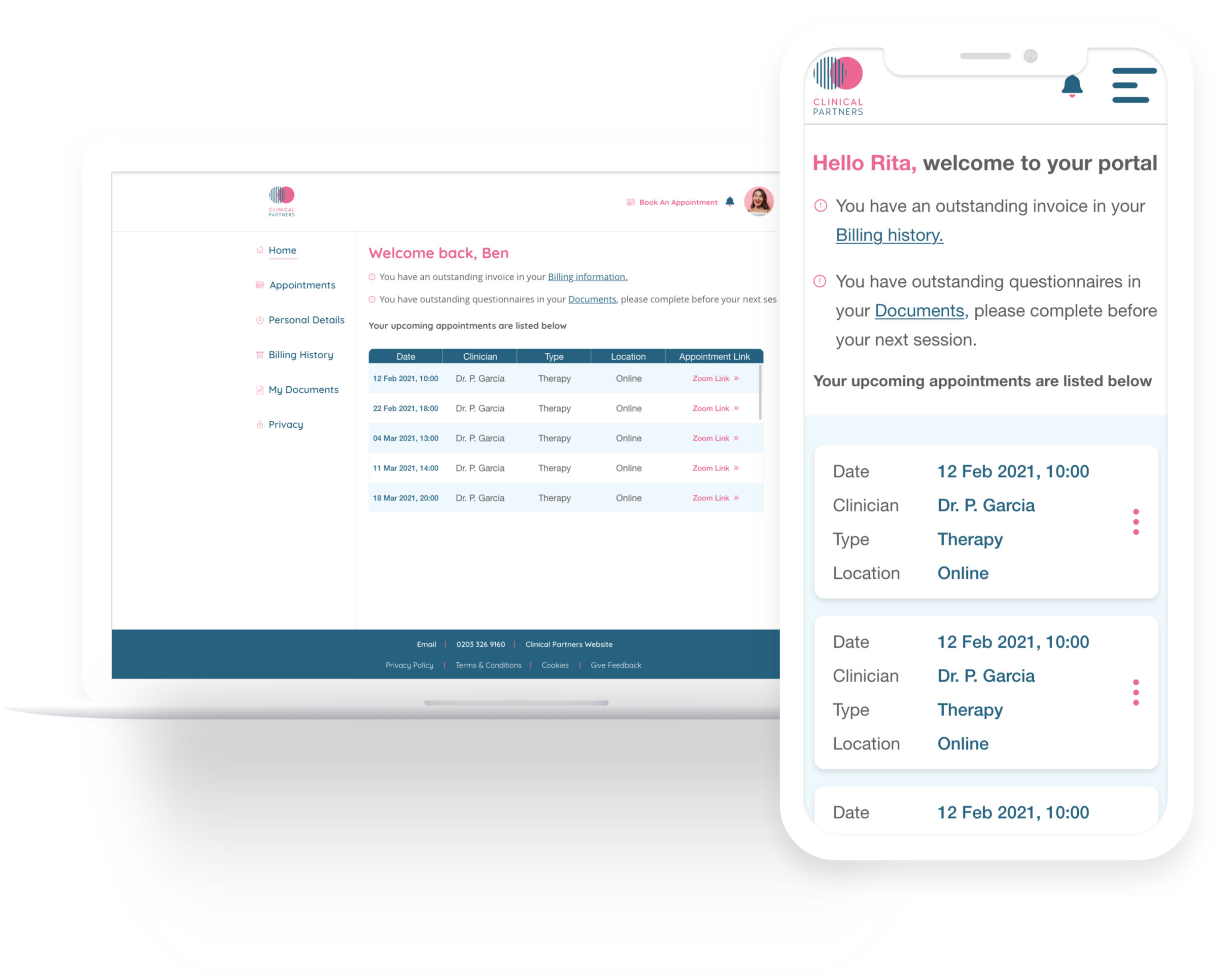
Prototypes prioritised upcoming appointments and immediate access to Zoom. The patient interface brought outstanding actions forward, simplified the list and made booking visible in the desktop header and mobile menu. The clinician calendar needed to support planning sessions and availability efficiently.
04 / Extend the experience
Design what happens before and after a session
The work extended beyond the appointment screen. User testing helped refine follow-up booking, patient questionnaires, clinician report filling and email onboarding for patients and clinicians. Reporting alone involved 13 unique reports with different formats according to the subject. Competitor research provided a starting point for these new journeys.
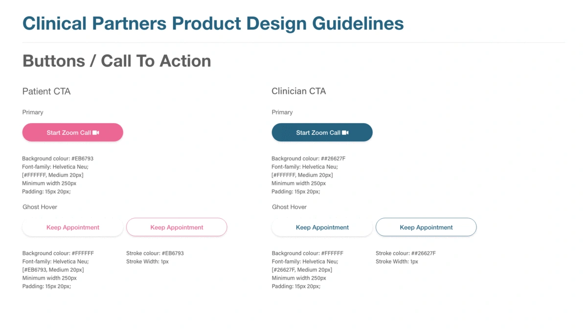
Alongside the product work, I collaborated with marketing on the rebrand and design system, keeping the portal in line with the new brand guidelines and consistent with other channels.
What the research brought into focus.
- FindingAppointment lists, filtering and calendars made it hard to locate the relevant session.
- ResponseSimplify the appointment list and filtering, and improve the clinician calendar for planning sessions and availability.
- FindingThe Zoom link was difficult to find at the moment it was needed.
- ResponsePut upcoming appointments on the homepage and the Zoom link in the list, with outstanding actions clearly prioritised.
- FindingTriage conversations highlighted sensitive communication and the importance of mobile access for privacy.
- ResponseUse considerate language, manageable chunks of information and clear priorities in a patient experience designed to work on mobile.
- FindingBooking and the supporting clinical workflows needed clearer next steps before and after a session.
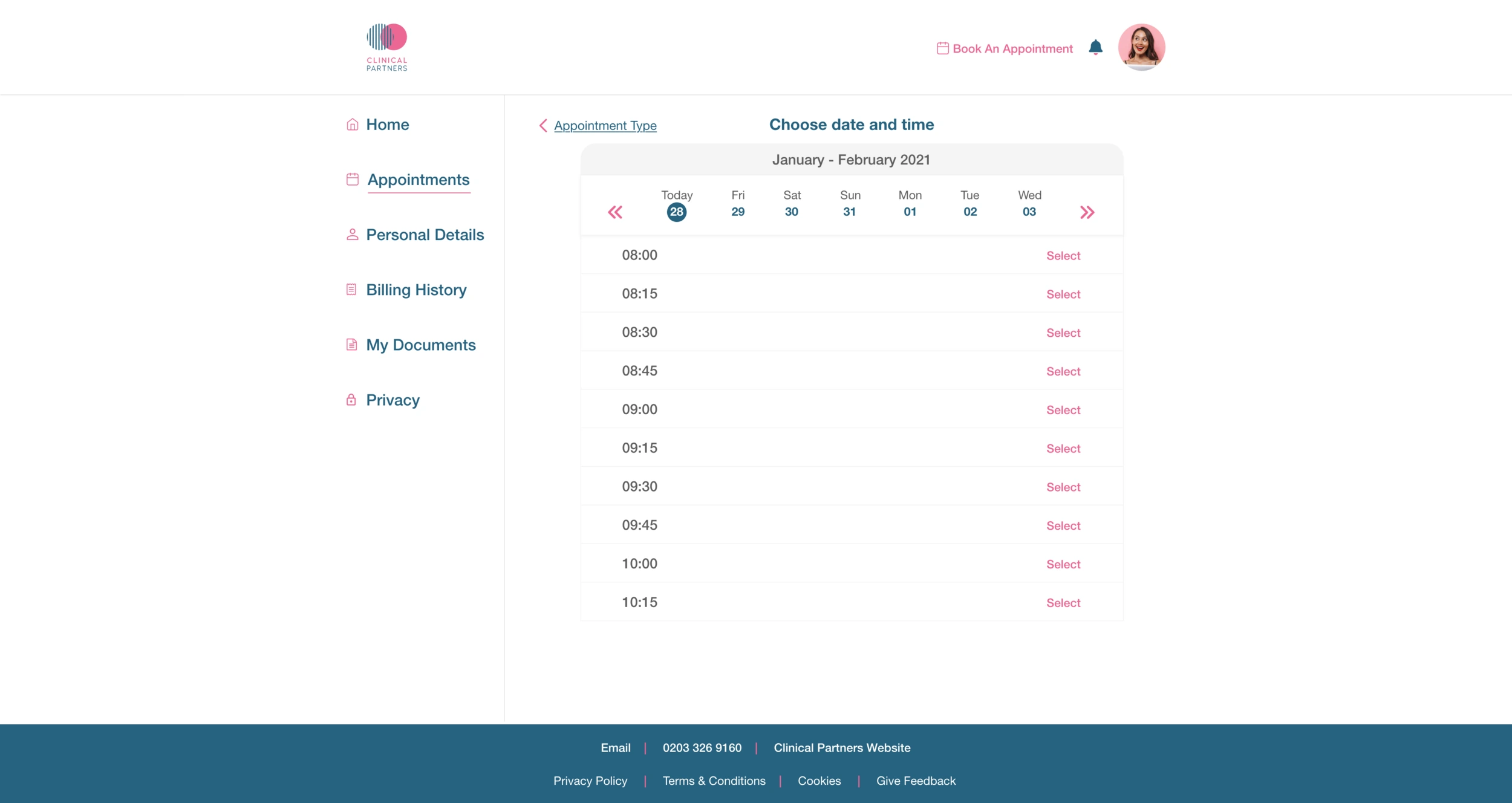
- ResponseMake Book Appointment visible in the desktop header and mobile menu; refine follow-up booking, questionnaires, 13 clinician report formats and onboarding email.
The decisions that mattered.
Improve the product already in development
I focused on making the existing beta usable within the delivery context. Reviewing the Salesforce components, wireframes and service workflow together helped identify changes that addressed immediate problems without starting the portal again.
Keep patient assumptions visible
Triage insight informed the patient experience, while clinician walkthroughs informed their own working tools. I kept that distinction clear: insight from people supporting patients could guide urgent decisions, but it could not substitute for direct validation with patients.
What changed.
The portal launched and received positive feedback. The work addressed appointment navigation, access to sessions and supporting booking and communication flows. It brought UX and UI improvements into a product already in development.
The product team responded quickly to problems and stayed open to ideas for improving both the portal and ways of working. The work connected the immediate appointment experience with the booking, reporting and onboarding journeys around it.
What the evidence can tell us
Patient insight came largely through triage staff and their phone and email interactions. Direct patient testing was unavailable in the sensitive context, leaving patient assumptions to be validated in further research. Quantitative post-launch outcomes are unavailable in the published evidence.
What I learned.
Proxy research can help a team respond to urgent service needs, but its limits need to remain visible. Further patient research, surveys and journey mapping would help test the assumptions behind the experience and guide subsequent improvements.
This project reinforced the need to consider the whole service when designing for care. A clearer appointment view matters, but so do the language around it, how privately someone can access it and the follow-up information they receive. Research with staff helped the team respond quickly, while making the limits of patient evidence explicit.