Adzooma / SaaS · Website & design system
Turning a new brand into a flexible website.
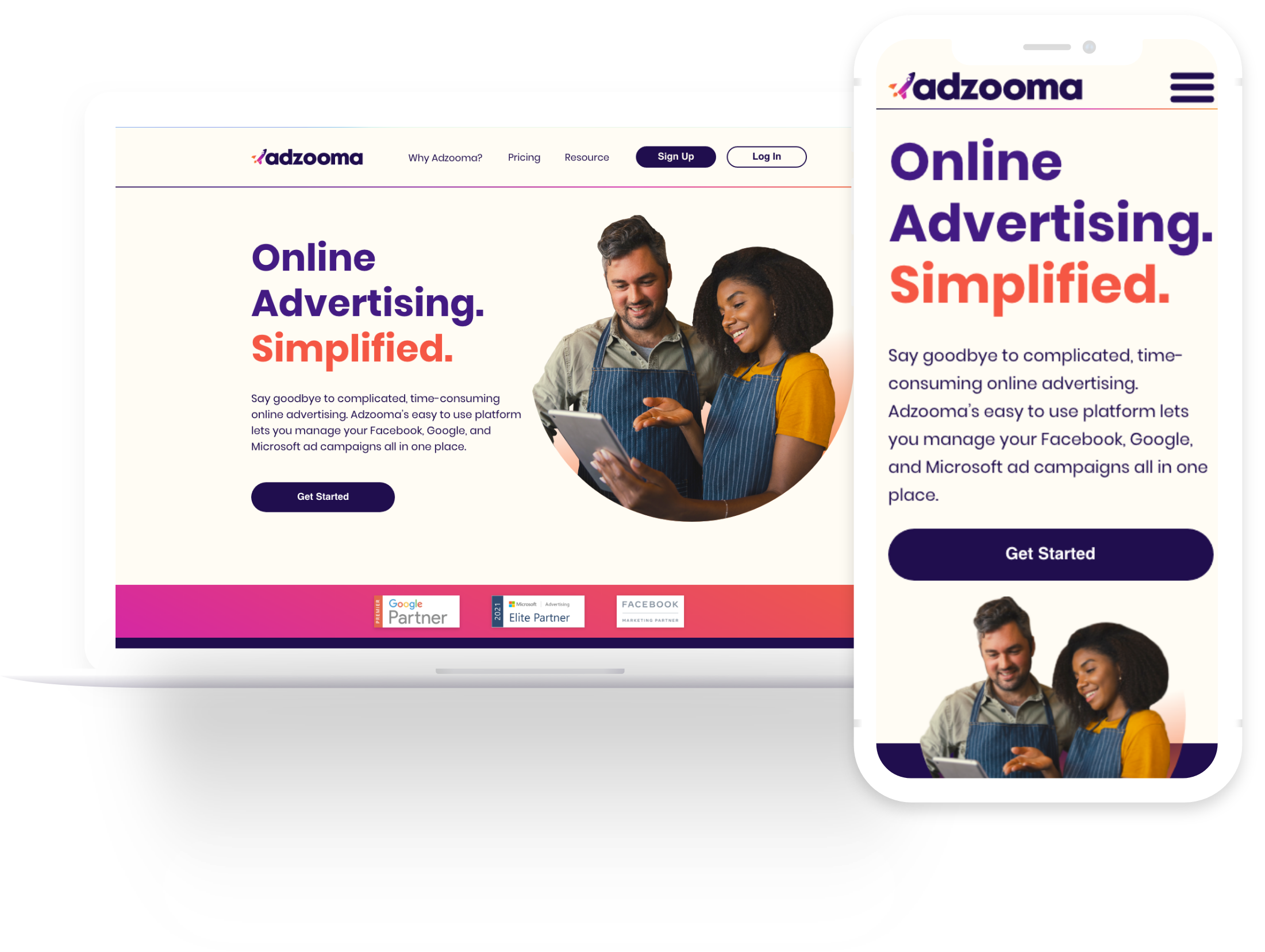
I led UX and UI work on a website redesign following a business restructure and rebrand. The team created a mobile-first experience and a shared visual system that supported the new audience and ongoing website changes.
- My role
- Lead UX/UI Designer
- Context
- Adzooma
- Timeframe
- 2019–2021
- Collaboration
- A digital designer, two frontend developers and two copywriters
The outcome in brief
A launched website and a shared foundation for future changes.
The challenge.
Adzooma brought Google, Facebook and Microsoft advertising into one marketing SaaS platform. A business restructure and rebrand introduced a new audience and required a website that could explain the product in an approachable way. The work was both a communication challenge and a practical redesign of how the team would create and maintain pages.
The site also needed to keep changing after launch. Rather than treating the redesign as a fixed set of finished pages, I worked with design, development and content colleagues on a foundation for ongoing edits and future experiments. Expected traffic from social campaigns made the mobile experience an early priority.
Scope: Website redesign and shared design system for a marketing SaaS platform combining Google, Facebook and Microsoft Ads.
My contribution.
- Led UX and UI for the website redesign and translation of the new brand into digital layouts.
- Brought development, sales and support together around shared goals and customer feedback.
- Developed wireframes and collaborated on the digital design system, CSS library and assets for the new CMS.
- Worked with a digital designer, two frontend developers and two copywriters on mobile, tablet and desktop content and layouts.
- Established the illustration direction and taught other designers how to create the assets.
From a new brand to a working website.
01 / Establish shared goals
Bring customer context into the room
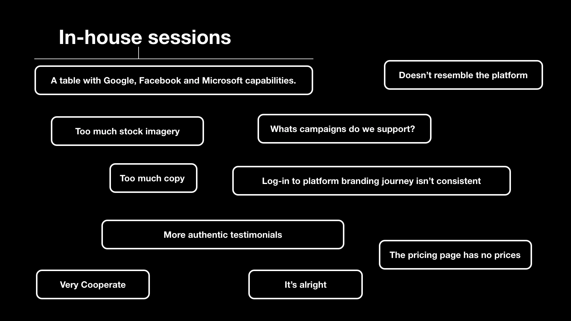
I ran shared-goal sessions with development, sales and support. These colleagues brought different perspectives on the product and direct exposure to customer questions. Bringing their feedback together helped the team discuss what the website needed to communicate and where the new direction should lead.
We also had data collected from the existing website since 2019. I used that context alongside wider benchmarking to inform the direction and build stakeholder trust.
02 / Translate the brand
Make the direction concrete in wireframes
Brand development and wireframes gave us a way to bring structure and content together before refining the finished interface. Working collaboratively helped connect the new audience, the product story and the practical requirements of the people building and writing the site.
The digital system grew from that work. Shared layouts and visual assets helped turn the brand into something the team could apply across the website, rather than relying on each page being designed independently.
03 / Build for change
Create a common design and development foundation
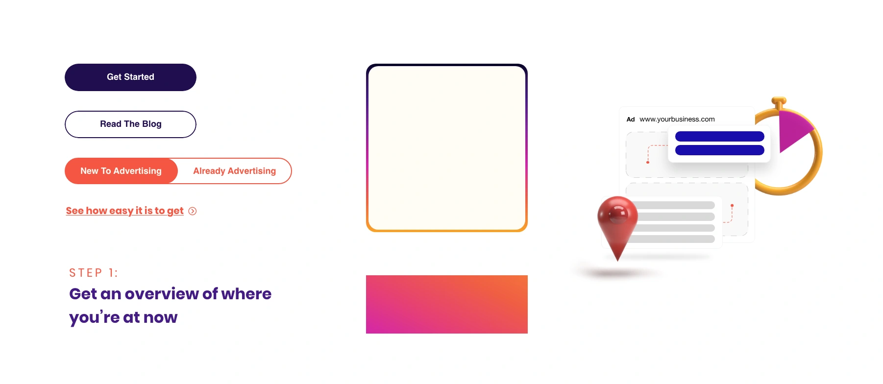
We developed a collaborative design system, a new CSS library and assets for the new CMS. The build was intended to reduce development time and make pages interchangeable through quick live edits. This would also be important for future A/B testing.
The system was intended to evolve as future research and testing informed changes. That mattered for a website whose audience and business direction were changing: the launch would establish a starting point for improvement, with further evidence informing later revisions.
04 / Explain the software
Use illustration and mobile-first content
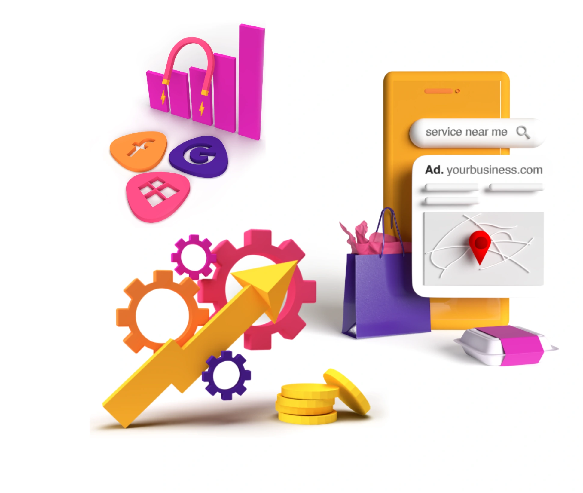
Customer feedback called for a friendlier, less corporate look. I chose 3D rendered illustrations with a consistent colour palette aligned to the new brand, reducing stock photography. Selected product assets explained the software without showing the whole platform, which could feel intimidating to entry-level users.
Social campaigns were expected to bring high mobile traffic, so design systems and copy were structured for mobile first, then adapted for desktop and tablet. Illustration production initially depended on me. I taught the other designers the approach until they could produce illustrations without my assistance.
What informed the direction.
- FindingThe restructure and rebrand changed who the website needed to speak to.
- ResponseAlign development, sales and support around shared goals, using customer feedback and benchmarking to shape the product story.
- FindingEntry-level users needed an approachable explanation of the advertising software.
- ResponseUse friendlier 3D illustrations in the brand palette, fewer stock images and selected product assets instead of exposing the whole platform.
- FindingThe website needed to support continued edits and future testing after launch.
- ResponseConnect the design system to a reusable CSS library and CMS assets, giving the team a common foundation for ongoing changes.
- FindingSocial campaigns were expected to make mobile an important entry point.
- ResponseStart with mobile content and layouts, then adapt the experience for larger screens. This decision was based on anticipated campaign traffic.
The decisions that mattered.
Make the launch a foundation for iteration
The design system, CSS library and CMS assets were part of the outcome alongside the pages themselves. They were intended to help the team make live changes and support experiments as it learned more about the new audience.
Share the capability behind the visual direction
The 3D illustration approach initially depended on my own capability. I taught the rest of the design team how to produce the assets until they could work without my assistance, making the visual direction more maintainable.
What changed.
The redesigned website launched, stakeholders aligned around the direction and the team met its deadlines. The work established a shared design foundation and broadened the team's ability to produce the illustration assets used by the site.
The deliverables extended beyond the redesigned pages: a collaborative digital design system, CSS library and CMS assets gave design, development and content colleagues a common starting point. Teaching the illustration approach also reduced dependence on my own production time.
What the evidence can tell us
The published case study provides no conversion uplift or other numerical performance results. User testing, A/B tests, heatmaps and further customer feedback were planned as subsequent evaluation, so their benefits cannot be claimed as achieved outcomes.
What I learned.
The launch created a foundation for ongoing improvement. Follow-up research and experimentation would help establish how well the new site explained the product, supported the audience and contributed to business goals.
A website redesign needs a workable way to continue improving it. Shared systems and shared skills helped make the direction usable by the wider team. The next step was to test how clearly the site explained the product and how well it supported the intended audience, using evidence from the live experience.